Creating an accessible, equitable opportunity to reduce food insecurity with Chicago’s Mayor’s Office for People with Disabilities (MOPD)
As an Inclusive Design Consultant, I advised designers and developers on accessible best practices and inclusive form solutions.
Project overview
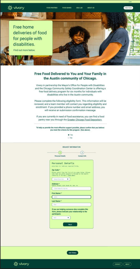
Our client, Therier Family Foundation leverages tech to support food nonprofits to get the funding they need and other IT support solutions. Partnering with Chicago’s Mayor’s Office for People with Disabilities (MOPD), they wanted to help address food insecurities in the city’s west side neighborhoods. The organization has received numerous support requests, especially from individuals with disabilities. However, their in-house team did not have an efficient system in place to manage all the requests. With an overwhelming number of phone calls, manual logging of information proved tedious.
As a result, their team sought to create an inclusive, accessible, and non-judgmental intake form to streamline the request process.
Team
1 Designer/Engineer
1 Accessibility consultant
5 Stakeholders
Goals
- To reach as many disabled residents as possible, the form must be accessible
- The form would greatly improve the intake process for internal teams
- Improving access to nourishing groceries for disabled residents in the Austin neighborhood of Chicago, IL
My role
- Advise and collaborate with the UI designer to build and design an accessible, user-friendly form
- Research best practices and contribute to design discussions around accessibility standards and recommendations
- Annotate web designs (desktop, mobile screens)with guidance to engineer regarding a11y functionality requirements
- Deliver training on maintaining accessible form
Design Consultation
I had weekly meetings with the designer and stakeholders to review the designs, discuss client requests, and offer recommendations. Throughout the design process, I prioritized disabled user experiences, transgender and gender-diverse inclusion, and clear, understandable language in the form.
Challenges and barriers:
- Color used in the design needed to meet color contrast ratios requirements
- Form labels and questions needed to be modified for to be more clear.
- Spacing inconsistencies between components and body copy, which made it harder to digest content
- Buttons and links needed visual attention, clear labels and were embedded in fieldset groups which makes it both confusing from a keyboard tabbing order perspective and harder to discover for assistive tech users.
- Asking for personal information that was not actually needed, such as gender identity or disability status/information

Form makes several improvements for both accessibility and user experience:
- The new design allows for users to choose more locations no matter where they entered the site. Scheduling a vaccine became an integrated, cohesive experience.
- Created custom radio buttons that are thoughtfully grouped in a visually digestible way. On the “Choose your Date and Time” pages, these custom radio buttons were grouped by fieldset legends so they are easier for screen reader users to access. “Available appointments” were broken up by: morning, afternoon, and evening groups for up to 28 days out from today’s date.
- To alleviate cognitive load and reduce the amount of content on a page, some vaccine information, like state eligibility or risk factors, we’re added to standard modal dialogs activated by buttons that are grouped with the relevant question. Buttons were not embedded within a component.
- Updated clinical language to use words that more users would better understand. For example, instead of saying “Are you immunocompromised?” we reframed the question to ask “Do you have a weakened immune system?”
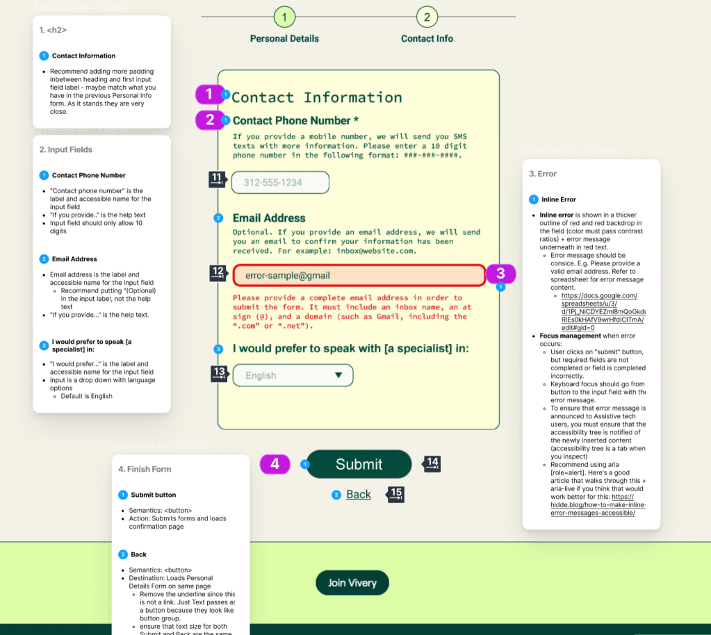
Annotating the experience for accessibility
This experience is a web-only application, designed to be responsive for Desktop, Tablet and Mobile views.
I work closely with the designer, so that feedback is delivered as they are working. During this time I am capturing the following in weekly meetings and asynchronous reviews:
- Review for visual design accessibility best practices following WCAG 2.1 A & AA standards
- Produce accessibility specifications
- Present review to stakeholders and support any accessibility questions they have
Once the design is ready for hand-off, I annotated the design using Figma to clearly communicate accessibility to the developer. Below are samples.